Société Générale
Mobile app redesign
I designed a mobile app for the French bank Société Générale that takes into account recent user interface practices for iOS. This work is fictional.

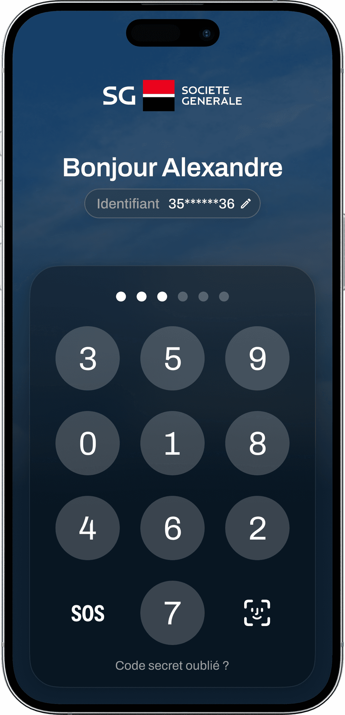
Lockscreen

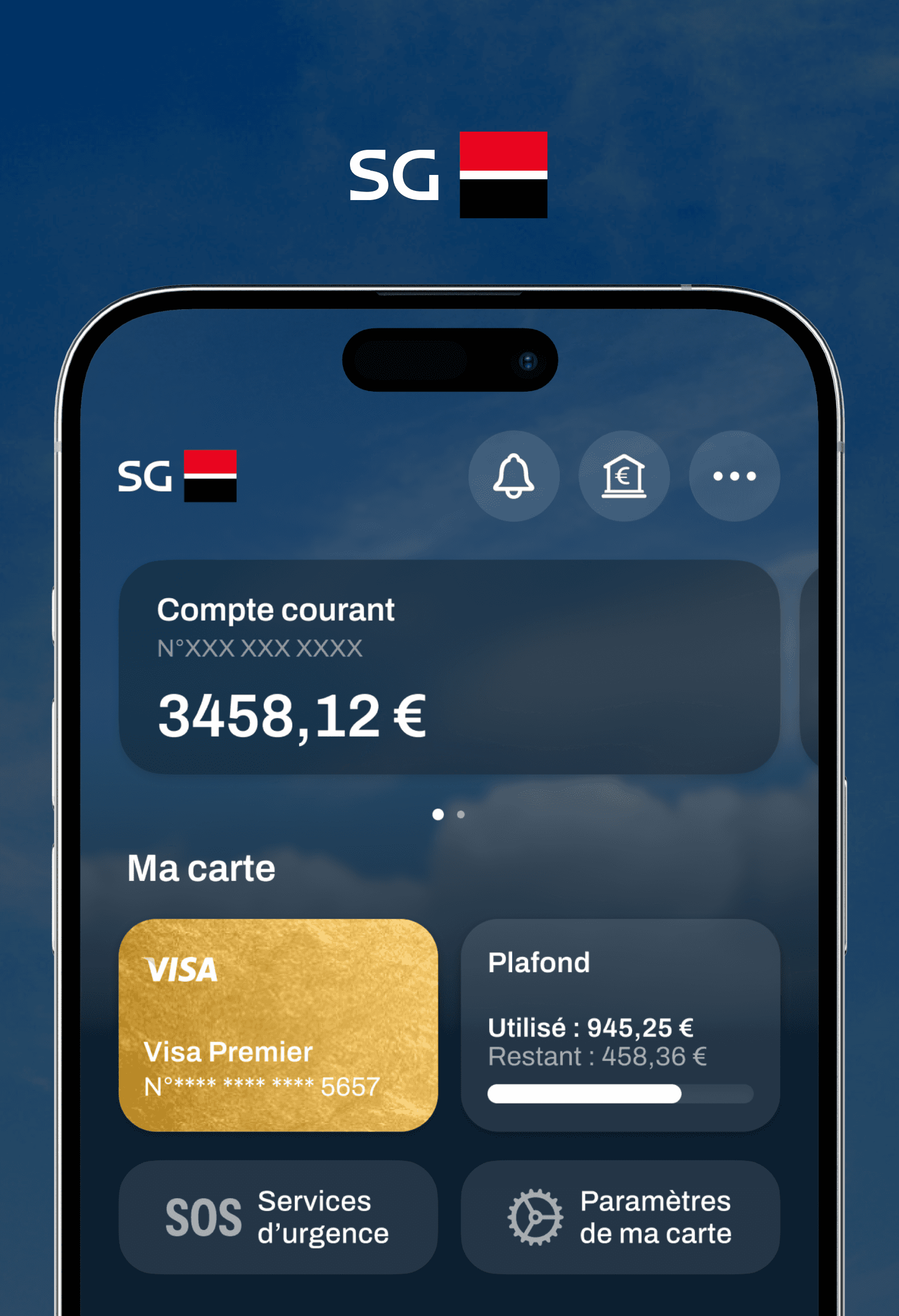
Home

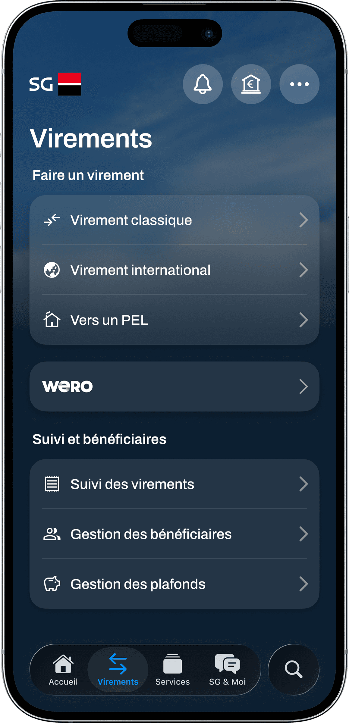
Money transfer
The current mobile app features three typefaces, many menus and paths for similar actions. Some touch targets are too narrow for comfortable use.


A new layout, based on the average comfortable reach for human thumbs has been designed. (Hover over the homepage to reveal it.)
Only one typeface is used throughout the interfaces (apart from the iOS Tab Bar), minimising noise.
A new design system, based on a slate hue has been crafted, reinforcing consumer and business trust.